
rebrand case study
Breast Cancer UK

evolution
Brand audit
Brand discovery workshop
Brand strategy and values
Tone of voice
Messaging
Brand identity
Brand book and toolkit
Brand application
background
Established in 2001, Breast Cancer UK (BCUK) has remained steadfast in its aim of delivering a patient-centred platform for breast cancer awareness and prevention, striving to combat the disease through education, scientific research, collaboration, and policy change.
challenge
When Breast Cancer UK first approached us, they were struggling to differentiate their cause and were often being mistaken with similar charities. The UK has seen an increase in the number of breast cancer charities, due likely to the growing recognition of the disease’s impact, and an increase in the number of cases.
As the sector became increasingly crowded, the charity was finding it difficult to be innovative and remain competitive.
problem
Whilst BCUK’s image and language was clean and informative, it lacked the emotional appeal and distinctiveness needed to set it apart from competitors, and the tone, which was formal and generic, detered their audience from actively engaging with it.
Additionally, the gap between funding and impact needed to be addressed through a confident and compelling brand narrative to seamlessly convey the how as well as the why.
solution
A deep dive into the essence and goals of the charity through a brand workshop with their team was our starting point.
Through structured exercises and strategic discussions, we were able to uncover the core values, differentiators and personality that would go on to define their brand.
The outcome was a robust, actionable blueprint that not only clarified the brand identity, but also aligned the team’s vision and goals enabling a cohesive approach to future operations.
insightful
We were able to gain fresh perspecitve by engaging directly with BCUK stakeholders. ‘Listening’ interviews – carried out by our associate specialist Anna Lake with a selection of donors, volunteers and beneficiaries – meant that we were able to gather valuable, authentic feedback that helped us tailor a rebrand strategy that would truly resonate with their audience.
Not only did the interviews provide key insights that informed the charity’s new identity, but they also strengthened trust and connection within their community in the process.
workshop
The essence of what emerged from the brand workshop was greater clarity on their purpose.
Think! associate and collaborator Olivia Dunn was able to refine the brand themes, develop their voice and craft a compelling brand story to breathe new life into their existing narrative. A powerful suite of brand messages would follow and go on to champion their prevention
movement.
brand identity
Capturing the spirit of the charity from the workshop wasa great spring board for the visual element of the branding. From it we were able to carry out our research and create moodboards to get creative ideas flowing and develop the creative routes.
initial ideas
Our typical approach for a brand logo presentation is to give 3 to 4 options, with generally 2 really good ones. But of all the concepts we came up with (many with shapes and symbols) it was a text based logo that became the front runner.
chosen route
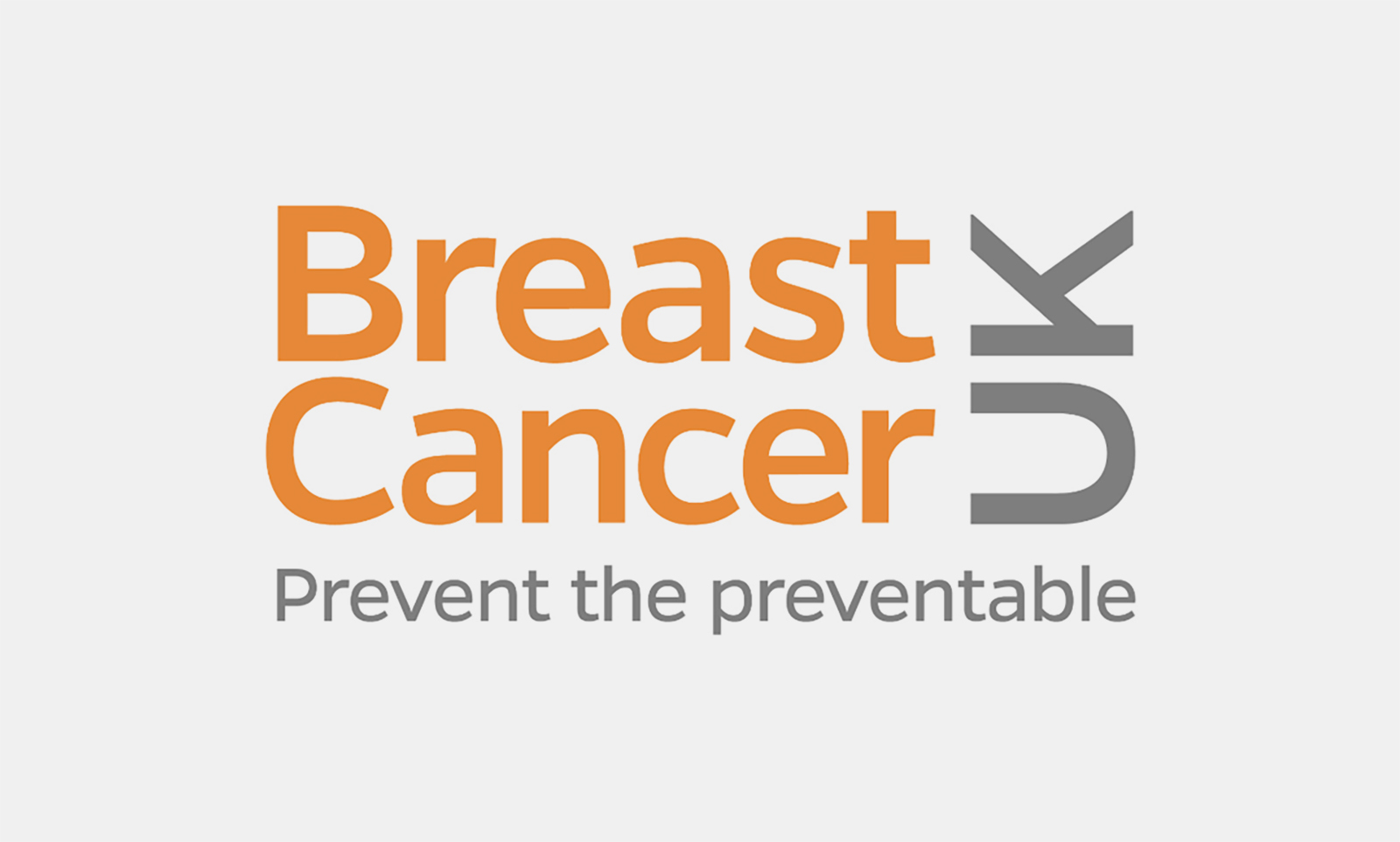
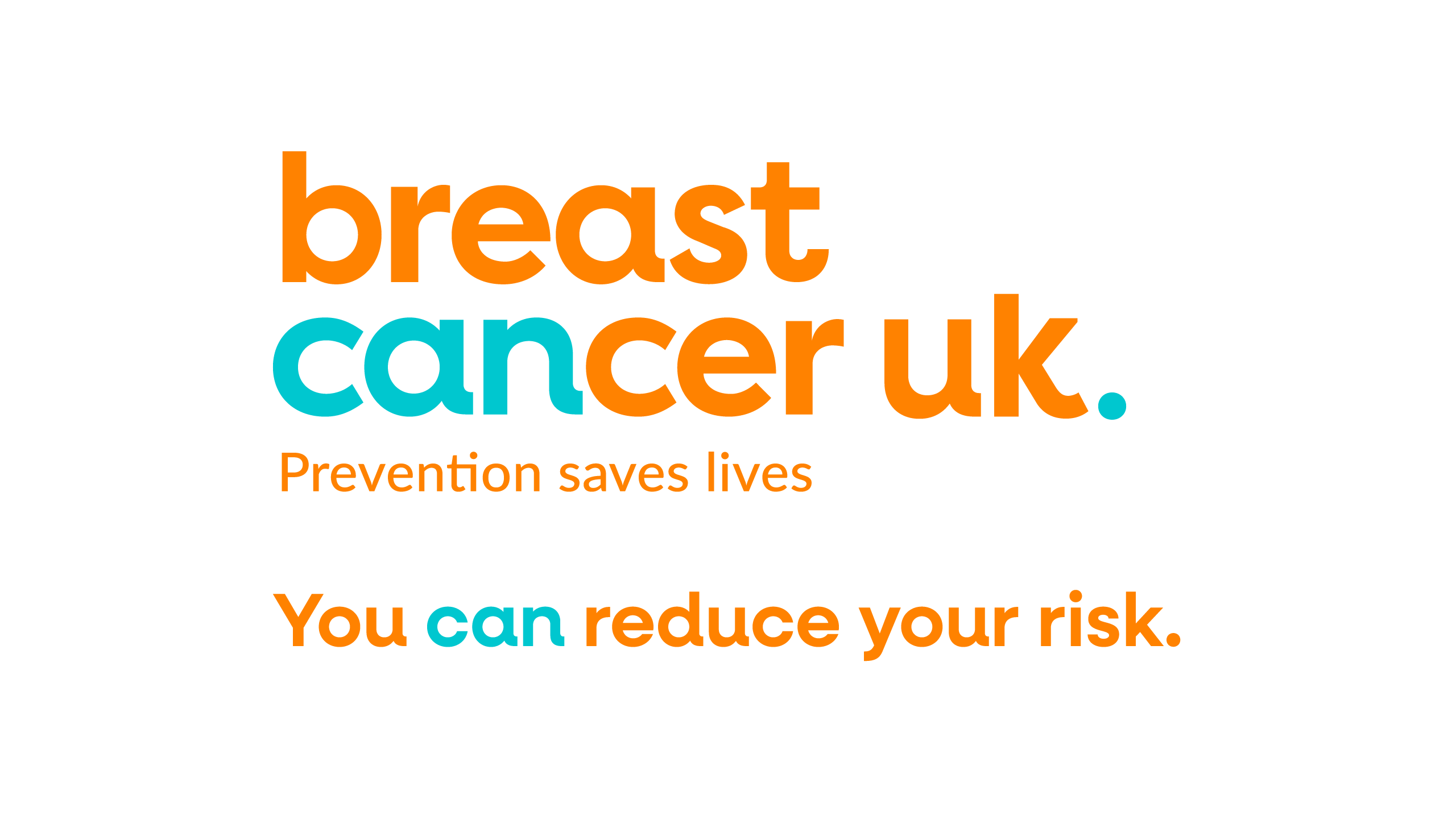
Sometimes the name of an organisation provides the key to its visual representation, and Breast Cancer UK is a case in point.
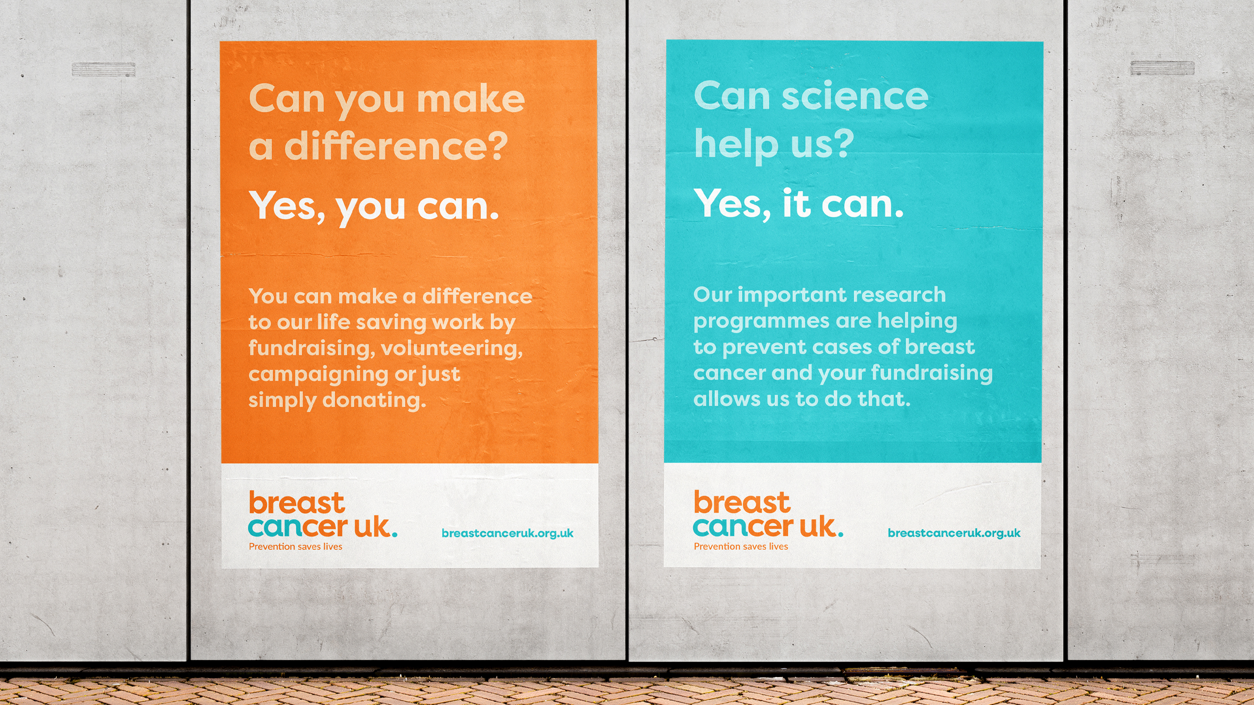
Identifying the word ‘can’ in cancer was a stroke of genius and would go on to serve as a cornerstone of the brand messaging, becoming a powerful call to action and motivating people to join the prevention movement.
the logo
This fresh and very straightforward typographic approach is as striking as it is simple, allowing the concept to create all the impact.
Stakeholder interviews had provided key insights into the use of colour. Avoiding pink was unanimously agreed, and retaining the current orange (albeit much fresher) felt prudent to bed the new logo in more immediately and maintain relevance for both genders. In addition a vibrant turquoise served as a nod to science which is a key pillar of the brand.
The chunky font, all in lower case with its charming upturns on select characters was chosen to convey an upbeat, playful vibe without being whimsical, so as to maintain credibility and not put anyone off from joining the cause.
preparing the presentation
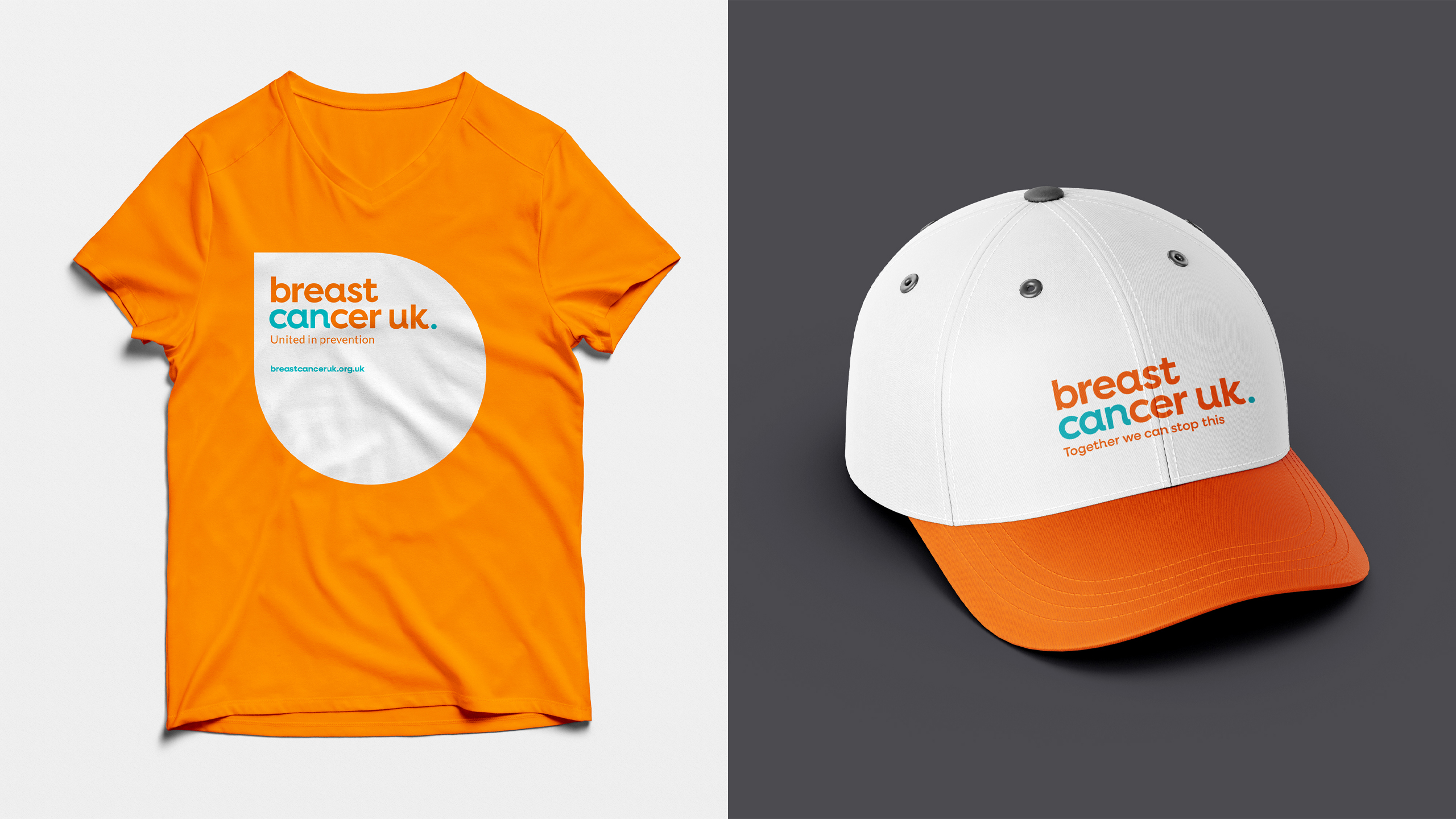
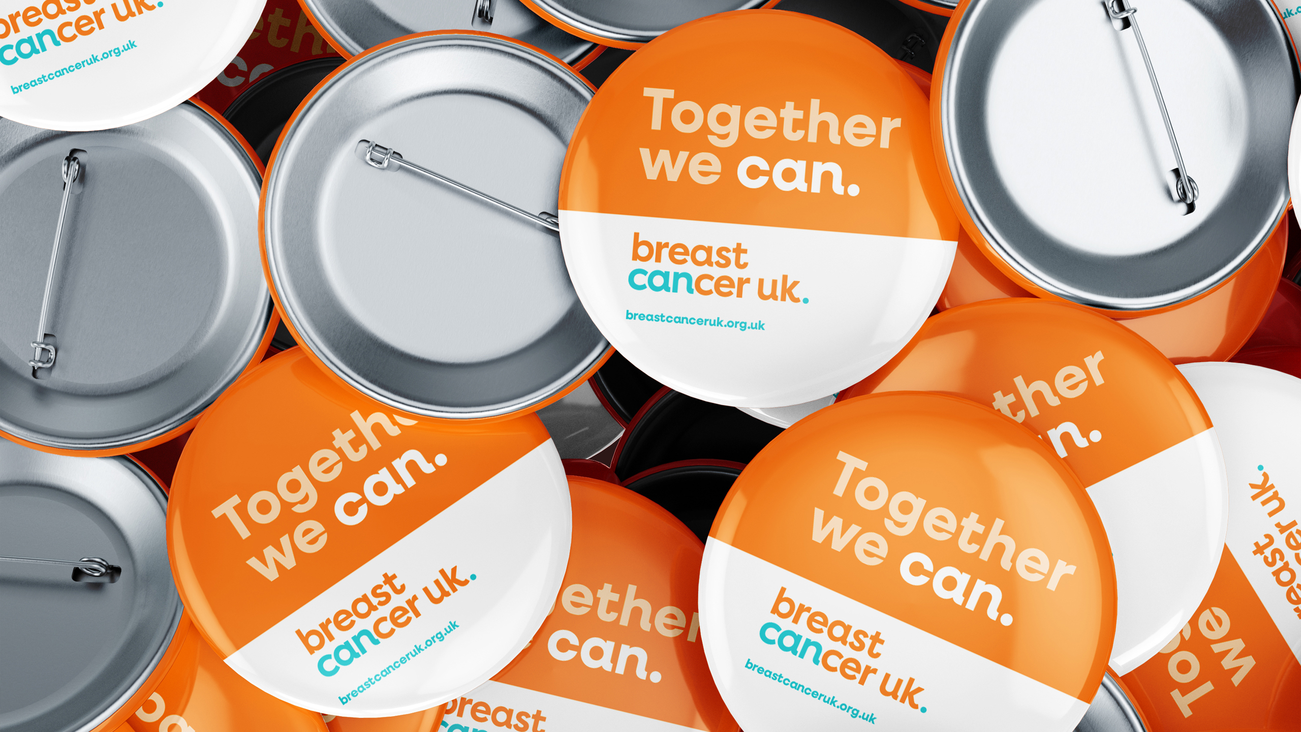
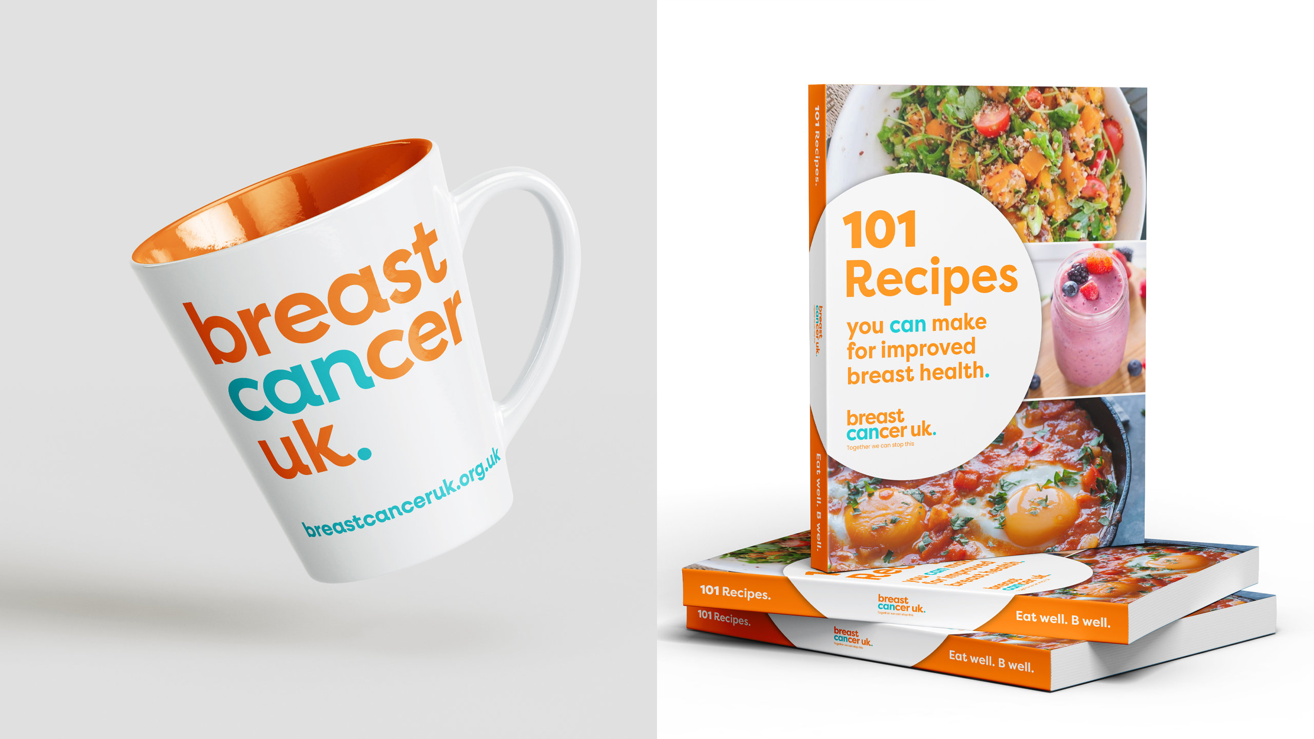
Part of every brand presentation is always to show clients what the brand would look like in-situ. It helps to see the bigger picture. As we had not yet been commissioned look at any of the digital assets, we focussed on merchandise and fundraising to demonstrate how the brand would be rolled out.
brand guidelines
The guidelines, or the ‘brand book’ as we like to call it goes way beyond the do’s and don’ts of using the logo.
- It is precise and distinct direction on how the brand should be communicated to avoid any misinterpretation or confusion.
- It ensures that the visual representation and messaging remains consistent across all media channels and touchpoints.
- It helps the brand stand out by establishing a unique visual and messaging style that sets it apart.
- It protects the brand from unauthorised use, helping to maintain the integrity of the identity by specifying what is and is not acceptable when representing it.
Once this phase was complete, we were able to provide the charity with their new brand and all its digital components with full rights.
what next...
Whilst the brand strategy, development and indentity work is done, this is by no means the end of the story.
As brand consultants, we continue to provide ongoing strategic guidance to ensure the new brand is consistently and effectively communicated across all channels, tracking its impact on growth and all the while fostering a collaborative partnership that keeps enthusiasm for the brand high and results on target.
If your business needs to rebrand, our team is here to guide you through every step of the process to create a brand identity that truly represents your vision and sets you apart in the marketplace.
